
Healdsburg Oral Surgery
Excellence in care, comfort in every step.
The complete brand for a Sonoma County surgical practice, from the logo and the language to every photo, video and patient guide.


The care was already there. The brand needed to catch up.
Healdsburg Oral Surgery was never meant to feel like a typical clinic. Natural light fills the rooms, the furnishings are soft and comfortable, and every detail is chosen to help patients feel relaxed and cared for. It feels more like a modern home than a medical office.
Dr. Adam Wandell and Dr. James Lelis had built that experience on purpose. What they needed was a brand that said the same thing before a patient ever walked through the door, in the logo, in the words, in the imagery, and in every form a nervous patient would hold in their hands.
So we built all of it, and the team stayed focused on care.

Healdsburg Oral Surgery and Dental Implants
Healdsburg, Sonoma County, California
Oral and maxillofacial surgery
Strategy, identity, creative direction, photo, video and design
One team, one vision, every touchpoint.
This is what the Blueprint looks like when a practice hands us the whole picture. Instead of coordinating a designer, a photographer, a videographer and a copywriter, the team had one partner holding the strategy from the first meeting through the final file.
- Brand strategy, vision, mission and promise
- Logo, color palette, typography and a tagline
- A complete brand guide with voice and tone
- Website copy and creative direction
- A full brand photography library and team headshots
- Commercial video for patients and referring dentists
- A welcome brochure and pre and post surgical guides
- Evergreen templates the team can keep using
Watch me deliver this brand.
This is the moment everything comes together. In this video I walk through the logo, the evergreen graphic design and the full brand identity, and why each decision was made for this practice.
Rooted in the place they serve.
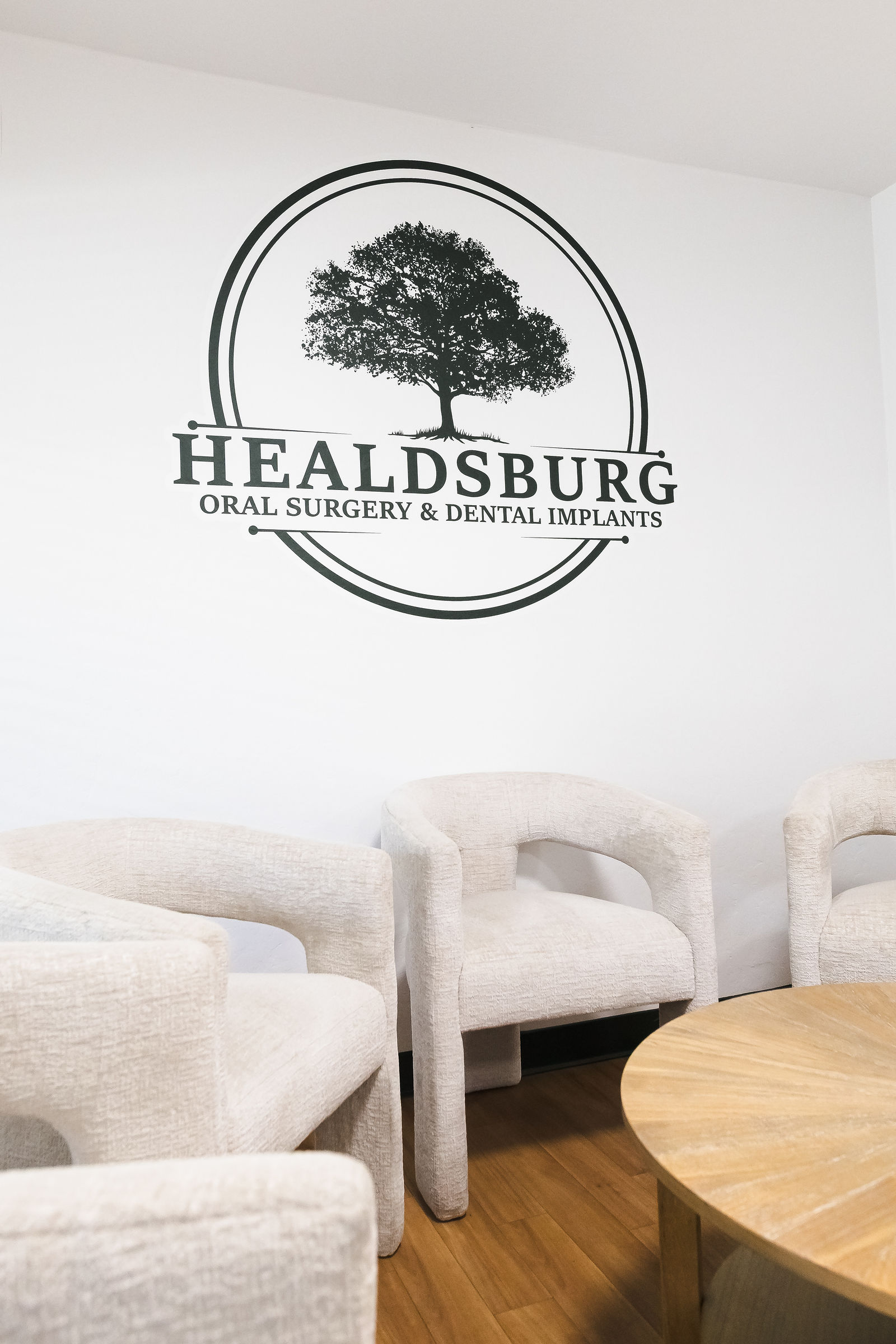
The practice already had a tree on the wall. We kept what it meant and refined how it looks, drawing a cleaner tree and pairing it with an elegant, quiet wordmark that feels calm instead of clinical.
Green carries the Sonoma County landscape, and the warm neutrals carry the feeling of the office itself. Every choice comes back to one promise: excellence in care, comfort in every step.


Look through the whole guide.
This is the complete brand identity guide we delivered, all 22 pages. It is the evergreen reference the practice uses for all of its marketing and branding, so the brand stays consistent long after the project wrapped. Use the arrows to turn the pages, or open it full screen.
A brand they can stand behind.
- Vision. To be the trusted surgical partner for patients, families and referring dentists in Sonoma County.
- Mission. Care that restores health, function and confidence through precision, compassion and innovation.
- Promise. Every patient is cared for as a valued individual, not just a case.
A library built for the whole practice.
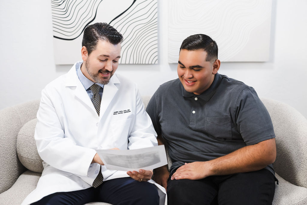
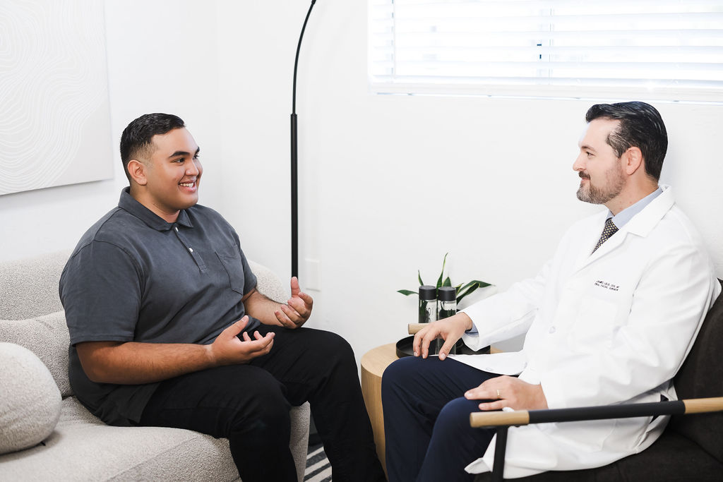
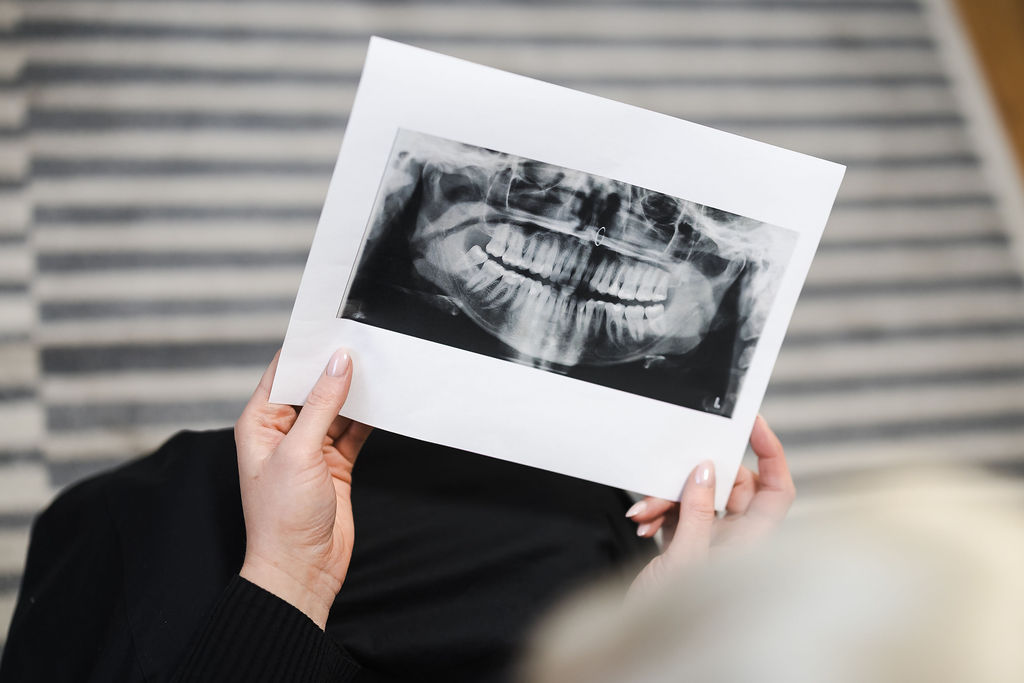
We planned every frame around how this team actually talks to patients: the arrival, the consultation, the scan on the screen, the handshake at the end. The result is a retouched library of 166 images in both color and black and white, plus more than 100 team headshots, organized for the website, marketing and print.











Fully directed, so the team could just show up.
Every shoot starts long before the camera comes out. We built the shot lists, the production timeline, the wardrobe and styling guide and the model plan, and the doctors filmed their scripts in small segments so nobody had to carry the whole day at once.
Photo and video ran side by side, which meant one production fed every platform.


We produced all of it.
Patients are often nervous before they ever pick up the phone, so the video work does a quiet job: it lets them meet the doctors, see the office and understand what will happen. Here is the full collection.
The brand, in a patient's hands.
A brand is not only what people see online. It is the brochure at the front desk and the instructions someone reads the night before surgery. We redesigned the practice's forms and welcome materials so every page feels as calm and clear as the office itself, and we left the team with evergreen templates they can keep using.


One clear path.
Strategy
We defined the tone, the positioning and the story before anything was designed.
Identity
Logo, palette, typography, voice and the guide that holds it all together.
Production
A fully directed photo and video shoot, plus team headshots.
Rollout
Forms, templates and imagery delivered in the formats the team uses every day.


Let's build something this complete.
If your care, your expertise or your experience has outgrown the way your brand looks, I would love to hear about it. We can start with one step, or we can build the whole thing together.
I've got you.